|
|

|
Meet the new Bolt.
Same lightning-fast checkout. Bolder look.
|
|
Team,
We're rolling out our refreshed brand identity, and you're the first to see it. This isn't just a new coat of paint. It's a sharper, bolder expression of who we are and where we're headed.
Here's what you need to know.
|

|
How we sound
Our voice has three guiding principles:
|
Principle One
Thoughtfully concise
|
|
Principle Two
Knowingly playful
|
|
Principle Three
Comfortably at ease
|
|
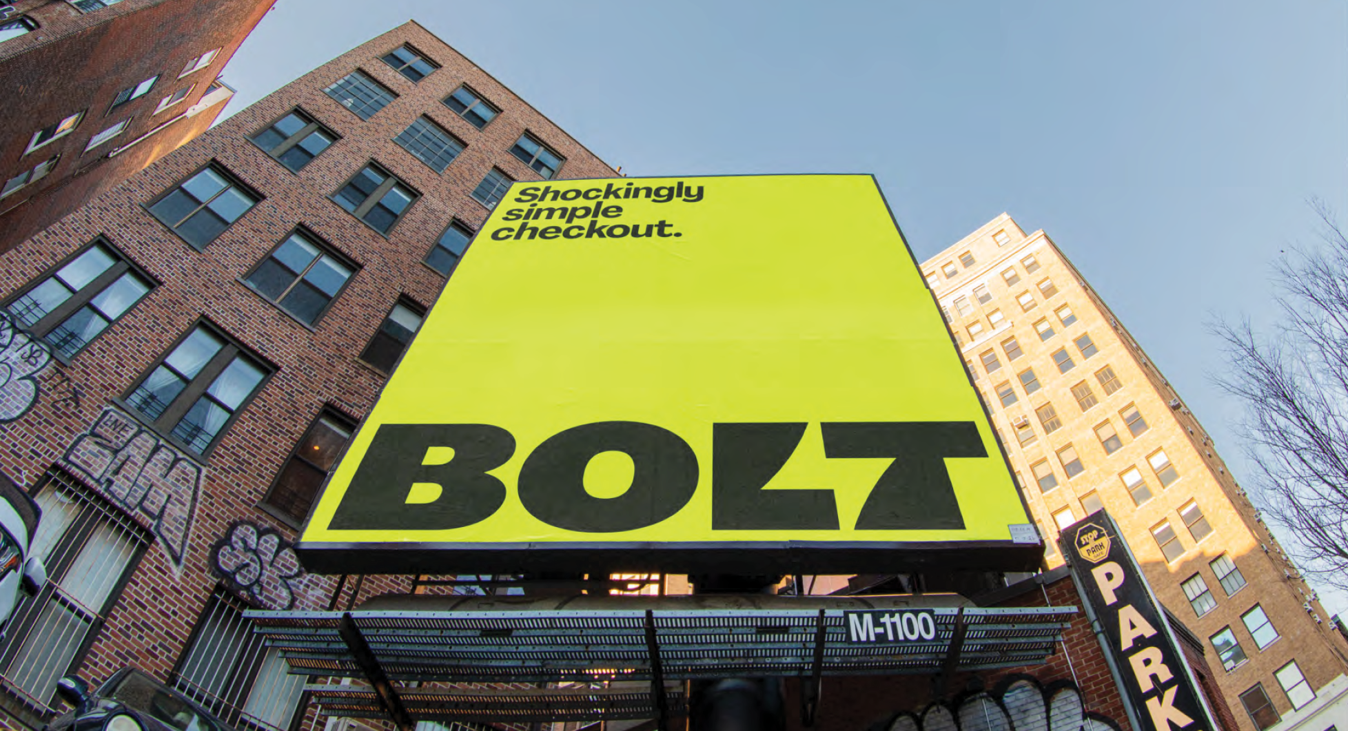
Brand in action
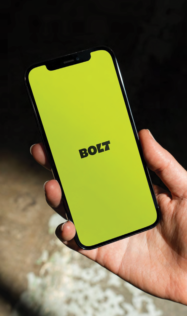
Our checkout experience, now with bold visual identity that stands out.
|
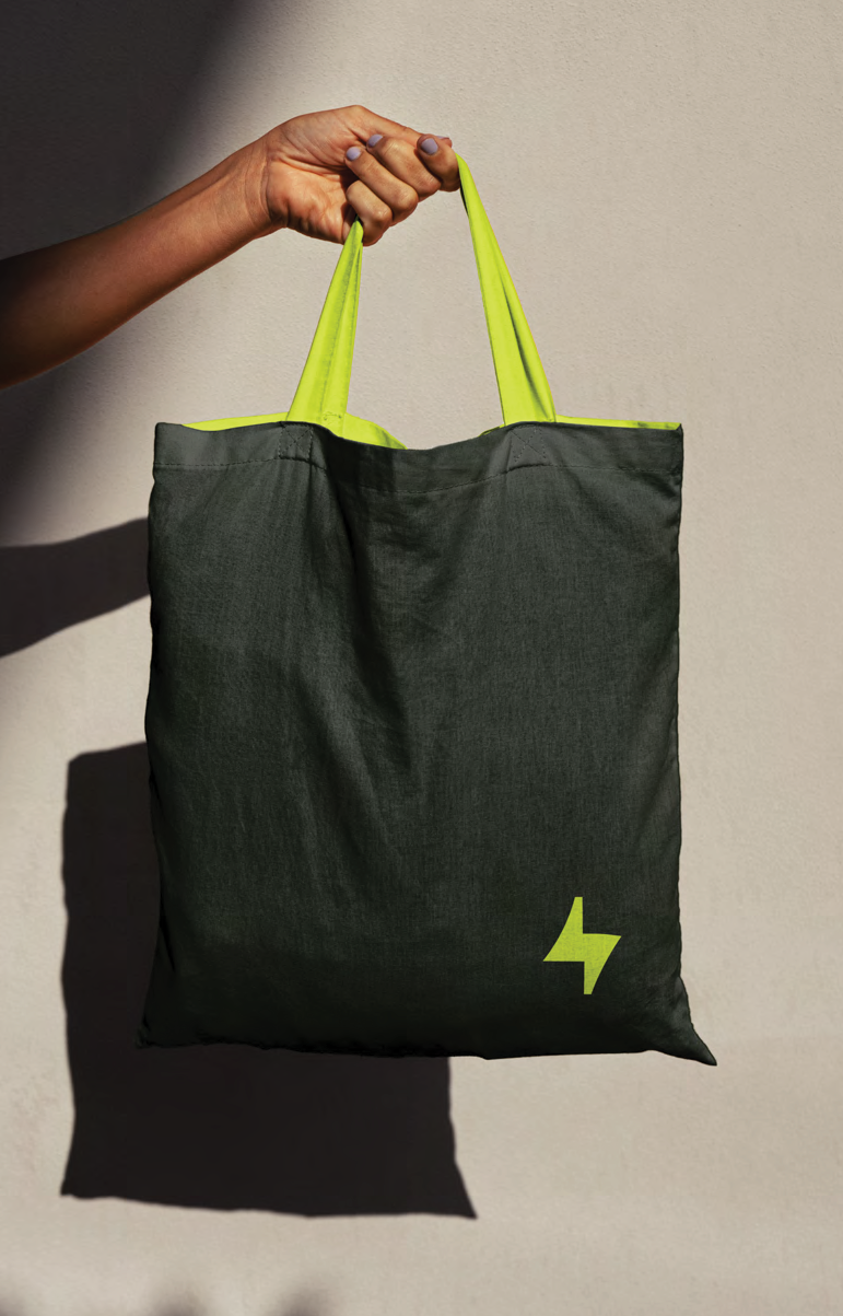
From digital to physical, the brand works everywhere.
|
|

|
Our colors
Lightning Yellow is our hero. Use it boldly.
|
|
Our typefaces
|
Headlines
Agrandir Narrow
Bold for headlines. Medium for sublines.
|
|
Body Copy
Inter
Medium for body text. Semi Bold for emphasis.
|
|
The logo
The lightning bolt in our wordmark reflects our speed. The solid letterforms reflect our trustworthiness. Treat it with respect.
|
|
Get the full guidelines
Download the complete brand book, logo files, and font assets.
|
|
Questions? Reach out to the Brand team. We're here to help you bring this to life.
Let's make something shockingly simple.
|